
- 24 January 2017
- Analysis
- #R, #epidemiology, #carto, #Tableau
Neglected Tropical Disease (NTD) are not rare diseases, but diseases that persist in neglected areas. Most of them are curable diseases, and have diseappeared from developed countries. An introduction of these diseases is made by the Médecins Sans Frontières, and this discussion present the issues around giving help to these regions, notably logistics. In the scientifique publication community, this recent paper on Eliminating the Neglected Tropical Diseases: Translational Science and New Technologies is particularly interesting.
NTD are mainly (but not only) located in tropical countries. I wanted to see which countries were the most affected by these diseases and which diseases were the most widespread. I also used the case of one disease, Lymphatic Filariasis, to find cluster of diseases.
1. Data
Disease data
The World Health Organisation lists 17 NTDs in 149 countries. However, not all diseases have global datasets. These datasets contain data of: new cases reported (incidence), cases (prevalence), individuals treated, and deaths in the case of rabies. Some of the NTDs data were more complicated to acquire, so they are not included in this analysis.
Background on theses diseases
Neglected Tropical Diseases (NTDs) are transmitted by flies, rabids, worms, or other people. In the buruli ulcer's case, the cause is even unknown. The consequences range from temporary disabilities (Dracunculiasis) to deaths (rabies). Most are easily cured (e.g. leprosy, rabies), but for some prevention is still difficult (Buruli ulcer).
| NTD | Disease | Vehicle | Consequence | |
|---|---|---|---|---|
| 1 | Rabies | Viral | Rabids | Death |
| 2 | Human African Trypanosomiasis (Tb Rhodesiense) | Parasitic | Tsetse fly | Nervous system |
| 3 | Human African Trypanosomiasis (Tb Gambiense) | Parasitic | Tsetse fly | Nervous system |
| 4 | Onchocerciasis (river blindness) | Infection | Fly | Blindness |
| 5 | Leprosy (Hansen's disease) | Bacteria | People | Disability |
| 6 | Visceral leishmaniasis | Parasitic | Sandfly | Death |
| 7 | Cutaneous leishmaniasis | Parasitic | Sandfly | Skin infection |
| 8 | Dracunculiasis (guinea-worm disease) | Infection | Worms in water | Temporary disability |
| 9 | Buruli ulcer | Infection | ? | Skin ulcer |
Some countries have managed to eradicate some NTDs (e.g. Mexico eradicated onchocerciasis), but NTDs are still endemic in many countries. Cutaneous leishmaniasis, also called the Aleppo boil, seem to be coming back in 2016, principally in refugees fleeing Middle Eastern countries.
Available data
I downloaded data for 8 NTDs:
| NTD | Data | Measure | |
|---|---|---|---|
| 1 | Rabies | Reported number of human rabies deaths | Mortality |
| 2 | Human African Trypanosomiasis (Tb Rhodesiense) | Number of new reported cases | Incidence |
| 3 | Human African Trypanosomiasis (Tb Gambiense) | Number of new reported cases | Incidence |
| 4 | Onchocerciasis (river blindness) | Reported number of individuals treated | Prevalence |
| 5 | Leprosy (Hansen's disease) | Number of reported cases | Prevalence? Incidence? |
| 6 | Visceral leishmaniasis | Number of cases | Prevalence? Incidence? |
| 7 | Cutaneous leishmaniasis | Number of cases | Prevalence? Incidence? |
| 8 | Dracunculiasis (guinea-worm disease) | Number of cases | Prevalence? Incidence? |
| 9 | Buruli ulcer | Number of new reported cases | Incidence? |
This heterogeneity of data types (new cases vs. cases - prevalence vs. incidence) is challenging to compare. However since some NTDs are chronic, others deadly, the measure selected by the WHO is likely to be a fair representation of the issue: e.g. in the case of rabies, which is easy to treat but deadly, a good measure of the issue in a country is the number of deaths rather than affected people. To simplify this analysis, I consider that the way the data was collected reflects a measure of the issue, and so these measures can be compared. However, I'm not an epidemiologist, so ideally I would ask one to know how this can be done.
Geographic data
The WHO data did not use the ISO number for countries, so I looked for geographic world data that represented the 'Country' name in the WHO data. The Natural Earth dataset had fairly similar names. Instead of using the country dataset, I use the sovereign states data, which seemed to fit with WHO data. However, it seems that the state of Tuvalu was lost in the generalisation (since only one of the NTD was recorded in Tuvalu, the issue should be treated in a larger analysis). I also downloaded the dataset of geographic lines which included the Tropics.
The present blog post will describe:
- Data cleaning & preparation in R
- Spatial analysis
- Statistical analysis
- Display on an interactive map.
2. Data cleaning & preparation in R
Data cleaning
The data I downloaded consisted of CSV files, one per disease. Each CSV file included only a selection of sovereign states with data for a selected few years (1990-2015). Missing data was inconsistent: some countries only had 'No data' while others had only '0'; however it was not clear if the "0" referred to missing data or to no data. For instance in Guinea-Bissau, cases of onchocerciasis (river blindness) were as following:
| Country | 2015 | 2014 | 2013 | 2012 | 2011 | 2010 | 2009 | 2008 | 2007 | 2006 | 2005 |
|---|---|---|---|---|---|---|---|---|---|---|---|
| Guinea-Bissau | 0 | 124517 | 107278 | 107835 | 135014 | NA | NA | 70616 | NA | NA | NA |
Since the number was pretty consistent over the years, it looks like missing data rather than 0 cases. For this analysis, to simplify, I considered "No data" to be equal to 0.
Loading spatial data with gdal
I used the gdal package to load the shapefiles downloaded at Natural Earth. Shapefiles can be directly imported into R, then you have two entities: the geographic data SpatialPolygonsDataFrame and the "attribute table", available when adding @data to the variable name.
library(rgdal) # Library to load shapefile
library(spdplyr); # Library to filter rows and columns

# Geographic lines that include the Tropics
geographicline <- readOGR(dsn = "Data_GIS/ne_50m_geographic_lines.shp",
                  layer = "ne_50m_geographic_lines", verbose = FALSE)

# World data from Natural Earth
world <- readOGR(dsn='Data_GIS/ne_50m_admin_0_sovereignty.shp',
                layer = 'ne_50m_admin_0_sovereignty', verbose = FALSE)

#colnames(world@data)

# Select column names
world_sel <- world %>% select(name_sort,pop_est)
# Rename the column name in the world database
world_name <- world_sel %>% rename(Country = name_sort)
Merge with CSV data
I downloaded the number of cases of all the diseases available on the WHO website. Not all the countries had been spelt the same way, so I first joined the dataframe of the shapefile and the data from WHO to find out which countries did not match:
wj1 <- full_join(world_name@data,rabies,by="Country").
I changed semi-manually the country names to match the Natural Earth dataset.
# Load data for Neglected Tropical Disease and take the latest year only
rabies <- read.csv("Data_neglected/human_rabies.csv")[,c(1,2)]
colnames(rabies)[2] <- "rabies"
countr_rabies <- colSums(!is.na(rabies))
[..] similar with all the CSV files.
# Merge with shapefile: uses spdplyr instead of dplyr
w1 <- merge(world_name,rabies,by="Country")

# Check that the merging went well by comparing with the length of loaded data
colSums(!is.na(w8@data))
Normalise with the population
The population size has a large effect on the number of cases in each country. Although the SMR (Standardised Mortality Ratio) should include the age and gender, here I only used the estimated population from Natural Earth (pop_est). I divided the number of case by the population and multiplied by a million to obtain a number easy to handle.
#pop_est comes from the Natural Earth data
# Only West Sahara has a population of -99; there are no NTD recorded there so it won't be a problem
w8$rabies_norm <- 1000000*w8$rabies/w8$pop_est
Considering rabies for instance, normalising by population change the top 3 from:
China, Philippines, Vietnam
to:
Guinea-Bissau, Philippines, Zimbabwe
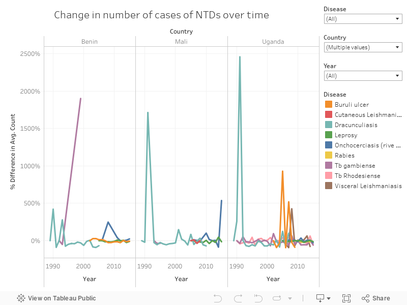
Visualise change with Tableau
I used Tableau to visualise change over time. The three graphs below correspond to the countries that have had the most change in the data available: Uganda, Mali, and Benin.
The embedded dashboard is interactive; it is possible to filter by Country, disease, and years to allow more exploration. The legend is also interactive, so click on any disease's name to highlight it.
3. Statistical analysis
Countries with the highest count of diseases
Countries are not affected in the same way by NTDs - some have multiple (up to 5), while others are still struggling with just one.
# Calculate the number of disease in each country

w8$rabies_yes[w8$rabies != 0] <- 1
w8$rabies_yes[w8$rabies == 0 | is.na(w8$rabies)] <- 0

w8$nb_diseases <- w8$rabies_yes + w8$leprosy_yes + w8$onchocerciasis_yes +
            w8$vleishmaniasis_yes + w8$cleishmaniasis_yes + w8$tbrhodesiense_yes +
            w8$dracunculiasis_yes + w8$buruli_ulcer_yes
# when needed remove the columns "_yes"
world_data <- w8[, -( grep("_yes$" , colnames(w8@data),perl = TRUE) ) ]

#head(world_data@data,10)
I selected the countries which have more than 3 NTDs, and plotted it on a radar graph to show the number of people recorded with the disease (or death, for rabies) in each country.
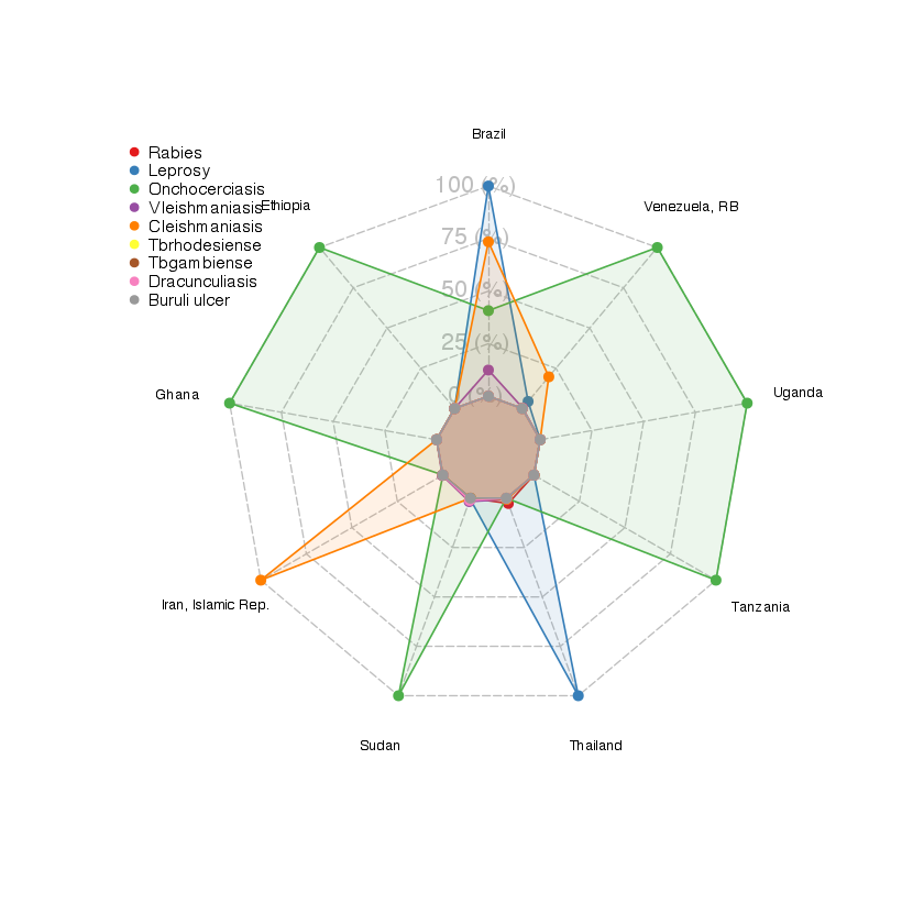
The radar graph shows that, in these most affected countries, onchocerciasis is affecting the most people and countries. Then only comes leprosy - which is affecting the most countries, but with a low count of cases.
Possible clusters of diseases
Transmittion of the NTDs varies (see Table 1), but there are constant - for one thing, NTDs are mostly in tropical to subtropical areas. I wanted to find out if there were clusters between the NTDs: are some diseases always occuring together?
arules
I used a data mining technique called 'frequent itemset mining' and used the arules package for R. The package was created to mine 'items' bought together during a 'transaction'. Here the transactions are the countries and the items are the NTDs.
# Select only the columns of interest
ntd_group <- w8@data[,c('Country','rabies_yes','leprosy_yes','onchocerciasis_yes',
                    'vleishmaniasis_yes','cleishmaniasis_yes','tbrhodesiense_yes',
                    'tbgambiense_yes','dracunculiasis_yes','buruli_ulcer_yes')]
# Change 0 into FALSE and 1 into TRUE
ntd_group$rabies <- as.logical(ntd_group$rabies_yes)
[..]
# Delect _yes columns
ntd_group_trans <- ntd_group[, -( grep("_yes$" , colnames(ntd_group),perl = TRUE) ) ]

# Create transaction
ntd_transactions <- as(ntd_group_trans, "transactions")
I first ran an 'apriori' rule
is <- apriori(trans, parameter=list(target="frequent", support=0.005))
to find the frequent NTDs. I obtained the following result:
items                                   support
[1]  {leprosy}                               0.8211382
[2]  {cleishmaniasis}                        0.2764228
[3]  {vleishmaniasis}                        0.2601626
[4]  {leprosy,cleishmaniasis}                0.1951220
[5]  {vleishmaniasis,cleishmaniasis}         0.1788618
[6]  {leprosy,vleishmaniasis}                0.1788618
[7]  {onchocerciasis}                        0.1707317
[8]  {rabies}                                0.1544715
[9]  {leprosy,onchocerciasis}                0.1463415
[10] {leprosy,vleishmaniasis,cleishmaniasis} 0.1219512
The first three are single NTDs. Leprosy is the disease the most widespread, so it is not surprising to find it as the most frequent here. If we go down to the 4th item, we find 'Leprosy' and 'cleishmaniasis' (Cutaneous Leishmaniasis), then 'cleishmaniasis' and 'vleishmaniasis' (Visceral Leishmaniasis), and then 'Leprosy' and 'vleishmaniasis'. These are the three most spread diseases across countries, with relative similar co-occurence. Nothing very surprising here, since Leprosy is the most widespread, and Cutaneous Leishmaniasis and Visceral Leishmaniasis come from the same type of infection. If anything, this can tell us at least, that they are indeed co-occurent!
Finally I ran another 'apriori' rule to find which presence of NTD would imply another one:
rules <- apriori(trans, parameter=list(support=0.05, confidence=.9)).
The top three association rules are:
        lhs                              rhs       support    confidence lift
[1] {onchocerciasis,tbgambiense}  => {leprosy} 0.05691057 1.0000000  1.217822
[2] {onchocerciasis,buruli_ulcer} => {leprosy} 0.06504065 1.0000000  1.217822
[3] {buruli_ulcer}                => {leprosy} 0.09756098 0.9230769  1.124143
with lhs for left-hand-side and rhs for right-hand-side. The occurence of the first implying the occurence of the latter.
The confindence value of rule [1] and rule [2] being 1, this means that where there is onchocerciasis and Tb gambiense or onchocerciasis and Buruli ulcer, 100% of the times there is leprosy. The lift here indicates that they are independant, which means that these two left
Therefore, in countries where there is Onchocerciasis and Tb gambiense, Onchocerciasis and Buruli ulcer, or Buruli ulcer, it is likely (confidence close to 1) that there is leprosy also. Since leprosy affects three times more countries than the other NTDs, it would be wise to remove it from further analysess.
Conclusion
The fact that leprosy is such a frequent disease compared to others skews the result, and makes it difficult to see real trend. Besides, many NTDs are missing from this analysis; those for which the data was not easily available. It would have been interesting to include Chagas and the dengue for instance, since they are also widespread.
Number of people infected per country
Since some countries struggle with multiple diseases, I calculated the total number of people affected by NTDs. As mentioned earlier, it's not a perfect calculation, and should not be taken literally since the numbers either refer to "the number of people treated", "the number of cases", or "new cases".
# Create a column summing all the cases
world_data$infected <- rowSums(world_data@data[,c("rabies", "onchocerciasis","Leprosy"
                                 ,"cleishmaniasis","vleishmaniasis","Tbrhodesiense",
                                 "dracunculiasis","Buruli_ulcer")], na.rm=T)
world_data$infected_norm <- 1000000*world_data$infected/world_data$pop_est

world_data@data$incidence <- ifelse(world_data@data$infected != 0,
                                    100*world_data@data$infected/world_data@data$pop_est,NA)
Looking at the number of people infected per country, we can isolate 14 countries for which 10 to 50% of the population is affected by one NTD.
highincidence <- subset(world_data@data,incidence >10 & !is.na(incidence),
select=c(Country, pop_est, incidence,nb_diseases))

# Top countries where 10 to 50% of the population is affected by
# an NTD.
highincidence[order(-highincidence$incidence),]
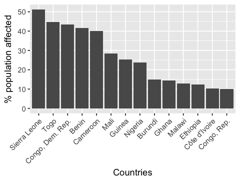
Every country in this top 14 is in Africa! Although Asia and South America are also struggling with NTDs, it seems that most people infected are in Africa.
Statistics for each disease
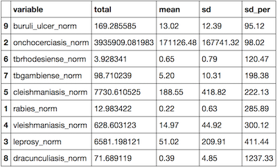
I ran some simple statistics to find the total number of people affected, the mean, and the standard deviation. For that, I used the ddply package in R.
ntd_stats_summ <- ddply(melted, c("variable"),
      summarise, total = sum(value,na.rm=T),
      mean = round(mean(value,na.rm=T),2), sd = round(sd(value,na.rm=T),2),
      sd_per = round(100*sd(value,na.rm=T)/mean(value,na.rm=T),2))
ntd_stats_summ <- ntd_stats_summ[order(ntd_stats_summ$sd_per),]
This resulted in the following table:
Influence of some economic variables
I used a few economic variables to find if there was a relation between presence of NTDs and GDP, economy, and income grp. These were variables easy to find in the Natural Earth dataset. I used a linear model in a first instance, but there was no significant relationship between the total number of people affected by NTDs in these countries and their income.
4. Spatial analysis
Spatial analysis would not be appropriate at the global scale in this case. For instance Cutaneous Leishmaniasis and Visceral Leishmaniasis both occur in Uganda, but in different regions. Trying to apply spatial statistics with global dataset would therefore not be very powerful and a regionalisation of the data is required.
Lymphatic Filariasis
The ntdmap.org website provides with more up-to-date and larger scale data. I downloaded the data for the Lymphatic Filariasis, a parasitic disease transmissible by mosquito bites and resulting in disfuguration so important that it impacts on the social and economique opportunities of those affected.
I used the point data LF Avg Prevalence (%), which consists of 7,000 points.
Density mapping
Mapping a density of points can help finding 'hotspots' where cases of Lymphatic Filariasis are frequent. The package spatstat provides with a simple density function.
spatialpoints <- as(SpatialPoints(LF_2016), "ppp")
LF_density <- density(spatialpoints, adjust = 0.3)
Then, by transforming the density into contour lines and keeping the most inner clustered points, we obtain the following map:
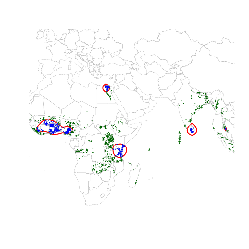
There are 5 clusters, which contain 31% of the points; which means that nearly a third of the cases of Lymphatic Filariasis happens in these countries. Lymphatic Filariasis seems to persist around in Egypt around the Nile (but also where most of the Egyptian population is located? In any case, this cluster is well documented. The Sri Lankan cluster is reported under control. The Zanzibar cluster had thought to be under control, but as found in this paper, there are still cases. The final cluster, which includes Ghana, Togo, and Nigeria especially, have also been going through some mass drug administration. Togo has apparently done real progress in 2013, but 2016 figures seem to suggest otherwise.
5. Spatial visualisation
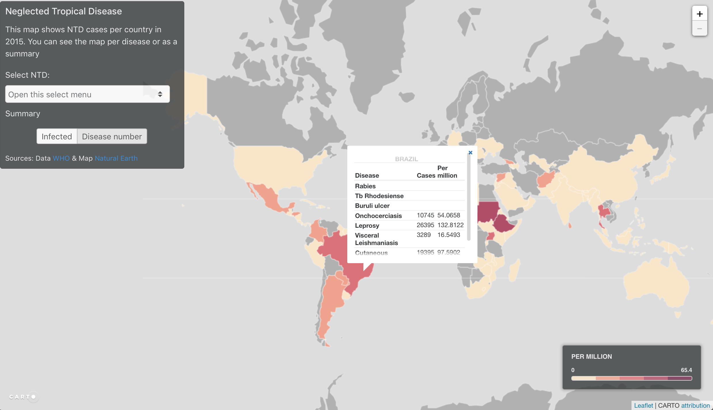
I used carto to show the informations I had created. First the data needs to be exported from R to geojson. Then imported in Carto and with a little bit of JavaScript, you obtain a visualisation tool.
Export to geographic data
Select the data with spdplyr
# Select only the Tropics
tropics <- geographicline %>%
  filter(grepl('^Tropic', geographicline@data$name))
Convert to geojson with geojsonio
Shapefiles are great for spatial analysis, but when it comes to use spatial data on the web, it's better to use it in a geojson format. It's only one file, and lighter than a shapefile.
library(geojsonio);
world_json <- geojson_json(world_data)
tropics_json <- geojson_json(tropics)
head(world_data@data,4)
#str(w8)
Simplify with rmapshaper
Geographic data tends to be quite heavy for browsers, so when possible, it's better to simplify it. In this case, since we don't need a great topological accuracy, we can simplify easily. rmapshaper does this in one line.
library(rmapshaper)
world_json_simplified <- ms_simplify(world_json)
Export geojson file
geojson_write(world_json_simplified, file = "Data_GIS/world.geojson")
geojson_write(tropics_json, file = "Data_GIS/tropics.geojson")
Import in Carto
I imported the data into Carto. Carto is great place to host geographic data into a spatial database without needing to create a geoserver. Although it would be possible to use the geojson directly into LeafletJS (a simple geo visualisation JavaScript library), using Carto can make data rendering faster (they have optimised the data visualisation), and then it's also easy to manipulate the data in the browser:
- SQL selection with
setSQL - Styling with
cartoCSS
I usually use the carto interface to get the values I want and then I write my own JavaScript script to get the visualisation I want. In this case, I wanted to use a choropleth map based, whose scale reflected the data, so I used the jenks scale. The scale updates when the data changes.
See it live
Click on the image below to see the interactive map.
Ressources
Data
- WHO
- ntdmap.org
- Natural Earth
Tutorial & R packages instructions
Epidemiology reads
Related posts
-
Shiny map interface
Shiny interface to explore places in Syria and upload excel file containing locations. Filters and time slider.